What is Giselle?
Giselle is an open-source visual AI app builder. You can create AI workflows by dragging and dropping nodes—no coding required. Once built, you can run them immediately.
We're building Giselle as a team, and we use it daily in our own work. This post is about how we used Giselle itself to design Giselle's UI.
When This Approach Makes Sense
This isn't a universal method. In many cases, separating UI design from implementation keeps things faster and cleaner.
But when the following conditions overlap, this approach worked:
- You're building a product you'll use yourself
- You need to move constantly between UI and code
- Specs aren't fixed—decisions keep evolving
- You're working with new experiences, like AI
In these situations, defining the UI upfront becomes nearly impossible. Rather than imagining a finished state, stacking decisions through working prototypes moved things forward more reliably.
Why We Designed the UI Alongside Implementation
While exploring Giselle's UI, we hit the limits of imagination-based design. Implementation constraints and existing structures don't reveal themselves early—they surface later, when they matter most.
So Giselle became less a tool for making UI, and more an environment for thinking with implementation in mind.
By referencing existing code and architecture, we could ask early: "How far can we build this?" "Where's the bottleneck?" Getting those answers first kept UI discussions grounded—not abstract.
That's why we chose not to separate design and implementation. We ran them together.
How We Actually Used Giselle
During UI exploration, our workflow looked like this:
-
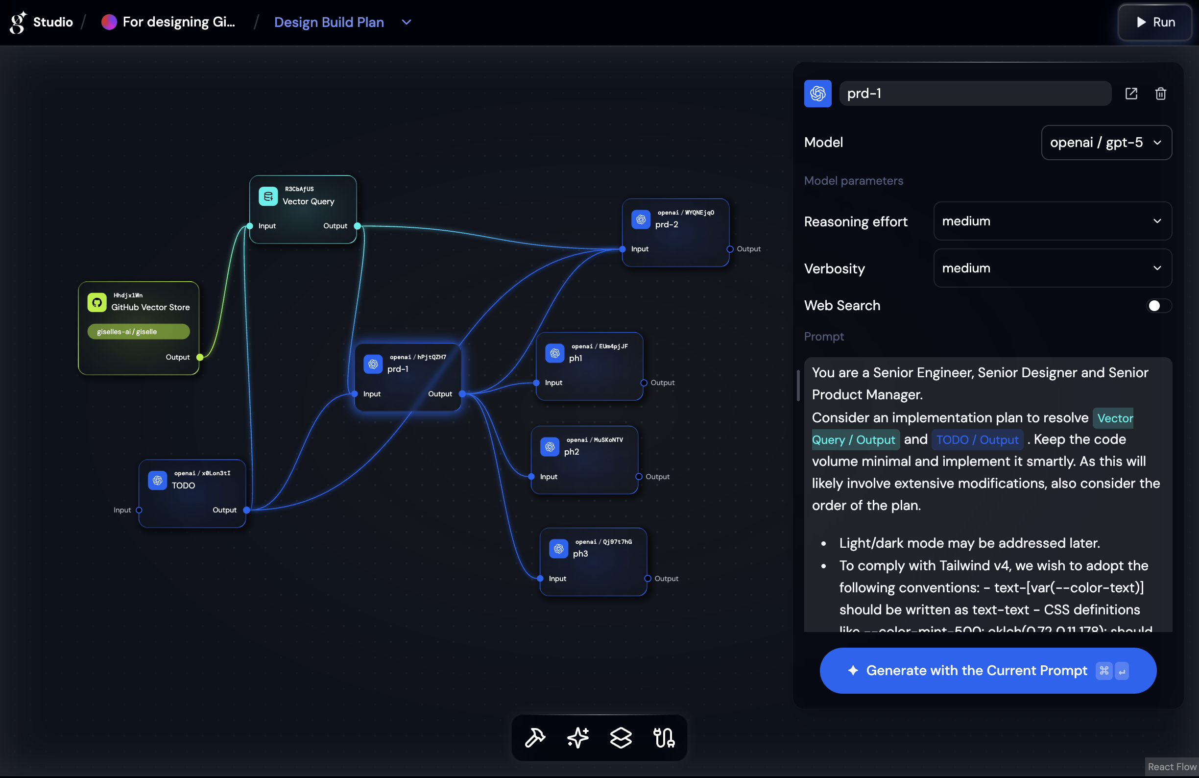
Loaded Giselle's own codebase into Giselle, so I could ask questions like:
- "How should I restructure the design system based on the current code?"
- "What does this feature actually do under the hood?"
-
Compared similar products visually—pasting screenshots of components from other tools and asking: "What would fit Giselle's philosophy?"
-
Sorted ideas on the spot by what was actually buildable
This meant I wasn't designing against a blank slate. The current implementation was always part of the conversation.

Before designing anything, I had to understand how engineers were actually building and using the product. The learning curve was steep—the domain demanded it.
Decision accuracy mattered more than polish, but I still wanted both. As a designer, I wanted to create something refined enough that people would want to make it their own. And because this was a new kind of tool, I tried to balance innovation with familiarity—though that balance wasn't always possible to strike.
Constraints, and What We Gained Anyway
This approach wasn't efficient. We hit dead ends. Broke things. Built UI that turned out to be unnecessary.
For example: I used vibe coding to build components based on Giselle's codebase. But when engineers reviewed them, they often pointed out simpler approaches I'd missed. Some components ended up heavier than they needed to be—working, but not clean.
That's the trade-off. You move fast, but experienced eyes still catch what AI-assisted prototyping doesn't.
But those detours weren't wasted. By running design and implementation together, what needed deciding—and where we were stuck—became visible early.
This isn't a repeatable best practice. But in phases where UI and implementation are tightly coupled, Giselle held up.
Designing Giselle while using Giselle. That process itself was the UI design.
